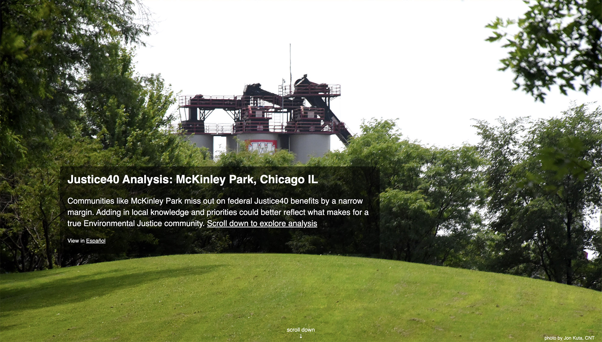
Justice40 Analysis: McKinley Park
An interactive environmental justice storymap exploring how federal climate investment criteria can overlook communities experiencing severe cumulative environmental burdens.
I transformed a complex federal environmental justice dataset into an accessible, narrative-driven experience that help communities understand why some neighborhoods are excluded from critical climate funding.
Role
Lead Designer & Front-End Developer
Responsibilities
UX Design • Visual Design • Interactive Storytelling • Mapping UX • Data Communication
Project Highlights
- Led UX design and front-end development for a longform interactive environmental justice storymap
- Translated a technically dense federal environmental justice framework into a narrative-driven experience accessible to non-technical audiences
- Combined elements of civic technology, environmental justice, data storytelling, cartography / GIS and community-centered design.
- Structured progressive disclosure patterns to reduce cognitive overload while preserving analytical depth
- Collaborated with researchers, advocates, and community stakeholders to align technical analysis with lived experience
- Data Visualization
- Interactive Maps
- Interactive Storytelling
- UI UX Design
Project Partners
- Center for Neighborhood Technology
- Neighbors for Environmental Justice
Audience
- Local governance
- Community leaders
- Community-based organizations
Visit the website:
Civic Data Storytelling for Environmental Justice
I led the UX design and front-end development of this multimedia experience in collaboration with Center for Neighborhood Technology and Neighbors for Environmental Justice. The project combines mapping, data visualization, oral history, photography, and longform storytelling to make the complexities of the federal Justice40 / CEJST framework understandable through the lived experiences of a single Chicago neighborhood.
The Challenge
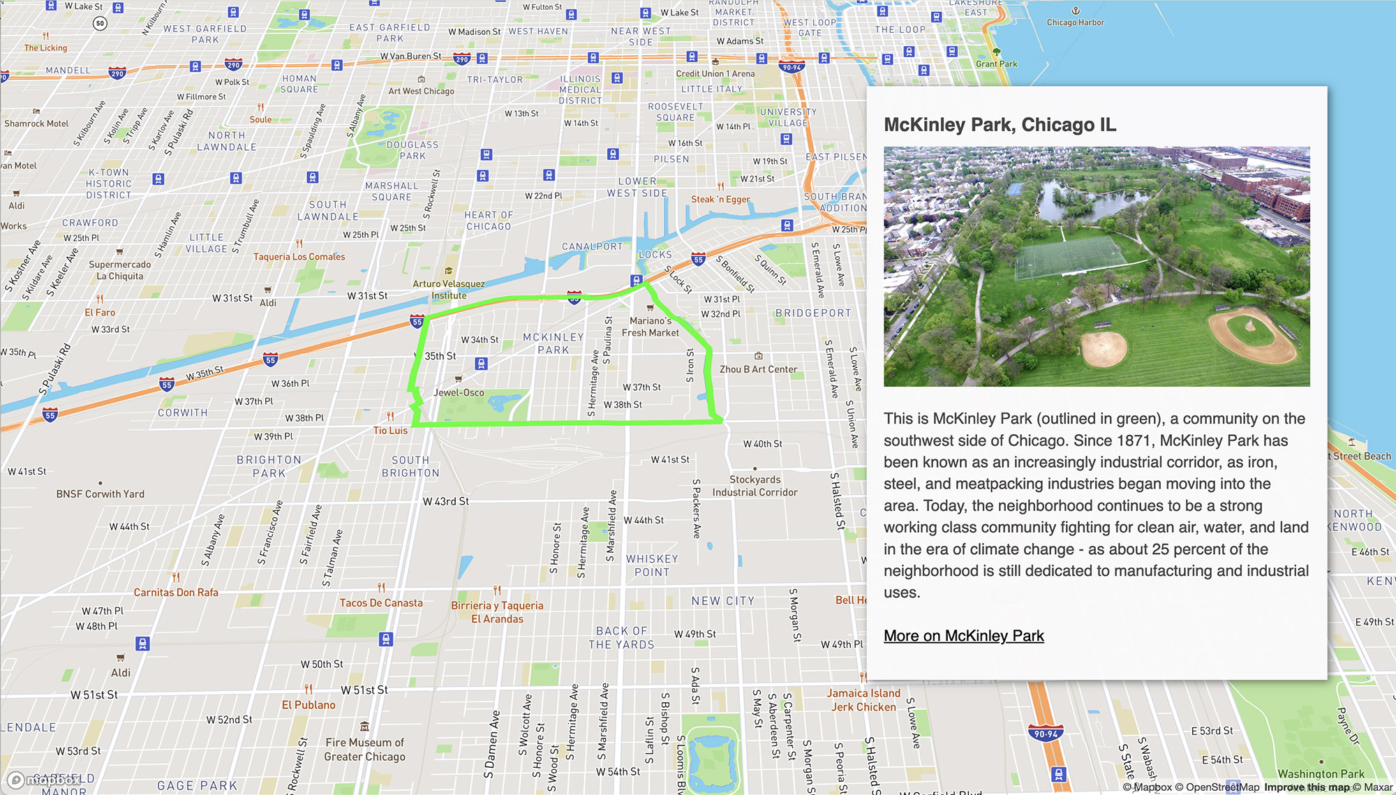
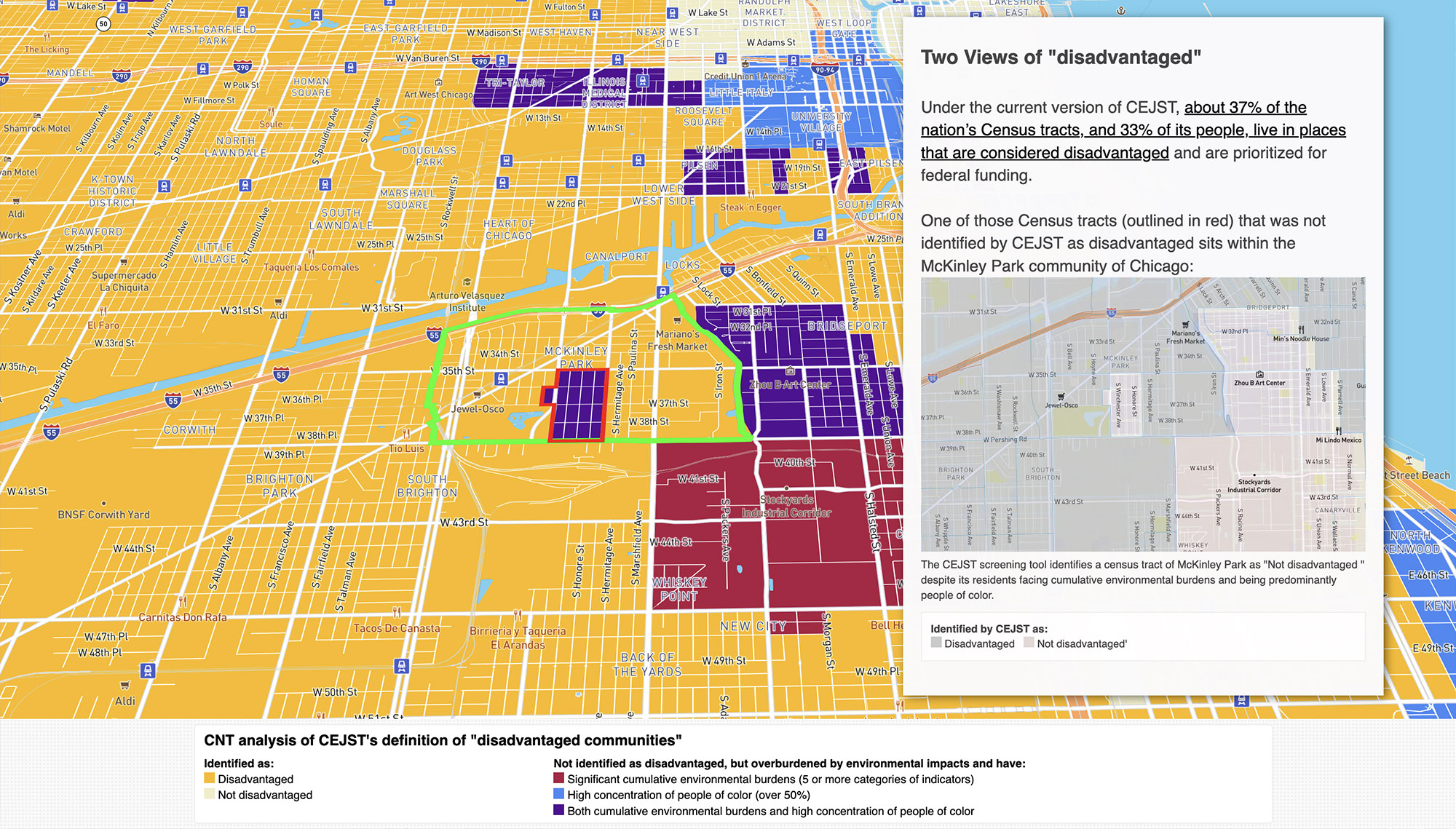
The federal Climate and Economic Justice Screening Tool (CEJST) was designed to identify communities eligible for Justice40 climate investments. But despite facing significant industrial pollution and environmental burdens, parts of Chicago’s McKinley Park neighborhood were excluded from the federal definition of a “disadvantaged community.”
The underlying analysis tool was technically powerful, but difficult for non-technical audiences to interpret. Dense layers of census data, environmental indicators, and policy terminology created a barrier for residents, advocates, and stakeholders trying to understand how these decisions affected their communities.
Translating Complexity Into Narrative
The central UX challenge was translating a technically complex environmental justice framework into an experience understandable to audiences without policy or GIS expertise. The design approach focused on progressive disclosure, narrative pacing, and spatial storytelling to help users build understanding incrementally rather than confronting them with raw analytical complexity upfront.
My Approach
I designed the experience around a narrative-scrolling structure that gradually introduces users to the environmental, historical, and demographic context of McKinley Park before revealing the underlying Justice40 analysis.
Rather than overwhelming users with maps and statistics upfront, the interface uses:
- sequential storytelling,
- immersive photography,
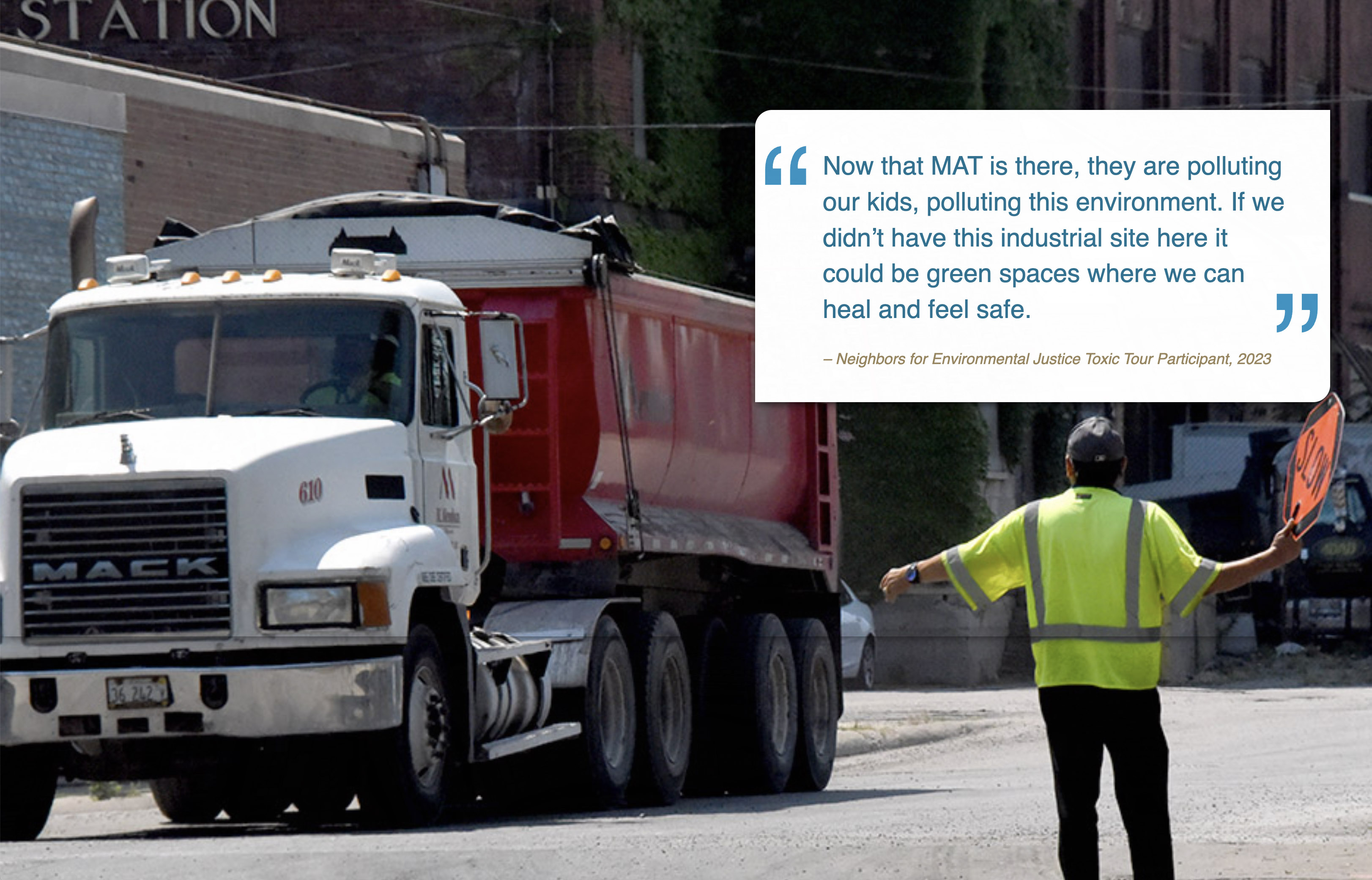
- embedded community perspectives,
- animated map transitions,
- and progressive disclosure of technical concepts
The goal of the storymap was to:
- humanize abstract environmental justice data,
- explain why the neighborhood was excluded,
- connect policy decisions to lived experience,
- and make complex spatial analysis understandable to broader audiences.
Design / UX Decisions
Narrative-Driven Scrollytelling. The experience uses longform scroll interactions to connect environmental data with physical geography and community history. Each section progressively narrows the focus from national Justice40 policy to hyperlocal neighborhood impacts.
Simplifying Complex Data. The original Justice40 analysis involved overlapping census, pollution, demographic, and infrastructure indicators that could easily overwhelm users unfamiliar with GIS tools. I designed visual hierarchy, progressive map layering, and guided annotations to reduce cognitive load while preserving analytical depth.
Human-Centered Mapping. Rather than presenting the map as a standalone technical interface, the project integrates maps directly into the narrative flow so users encounter spatial data alongside photography, testimony, and historical context.
Responsive Experience. The storymap was designed to function across desktop and mobile devices while maintaining synchronization between narrative content, maps, media, and interactive elements.
Collaboration
I collaborated with policy researchers, environmental justice advocates, and community stakeholders to shape how the analysis was communicated visually and narratively.
The final experience reflects both quantitative analysis and lived community experience.
Impact and Outcome
The storymap helped contextualize the limitations of the federal CEJST framework by showing how communities experiencing real environmental burdens could still fall outside official funding criteria.
The project became part of CNT’s broader Justice40 analysis initiative, supporting community engagement, policy discussion, and advocacy around equitable climate investment.