Chicago Truck Data Portal
Which communities are most affected by diesel pollution—and why? This interractive analysis pairs hard data with lived experience to reveal the burden of freight traffic some communities face across Chicagoland.
Role
Lead Designer & Front-End Developer
Responsibilities
UX Design • Visual Design • Interactive Storytelling • Mapping UX • Responsive Development • Data Communication
Project Highlights
- Collaborated with project partners and community stakeholders to translate complex environmental data into a clear, human-centered story.
- Designed interactive maps and charts that distilled technical findings into accessible, easy-to-understand visualizations.
- Shaped the presentation of a unique data collection effort that quantified neighborhood-level truck traffic through both quantitative measurement and qualitative community insight.
- Data Visualization
- Interactive Maps
- Interactive Storytelling
- UI UX Design
- Website Design
Project Partners
- Center for Neighborhood Technology
- Little Village Environmental Justice Organization
- Fish Transportation Group, Inc.
Audience
- Policymakers
- Community-based organizations
- Environmental justice advocates
Visit the website:
Collecting Data and Telling the Story
This project centers on a critical question: how does diesel truck traffic impact community health—and who bears the burden?
At the outset, neighborhood-level truck traffic data simply didn’t exist. Without it, community concerns about diesel pollution were difficult to measure and impossible to map.
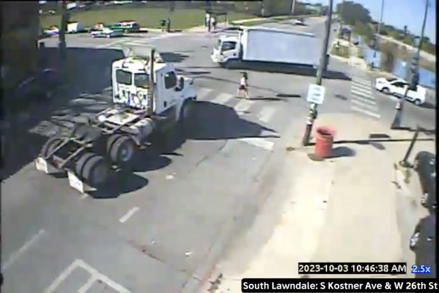
To close that gap, we partnered with Fish Transportation Group, Inc. to deploy Miovision Scout cameras at 47 locations across Chicago. These sensors recorded real-world vehicle movements, producing the first localized dataset capable of quantifying truck activity at a community scale.
As research and community outreach expanded, I developed design systems to support ongoing analysis and evolving content. The result was a ground-level dataset—and a digital platform—that brought measurable insight to lived experience.
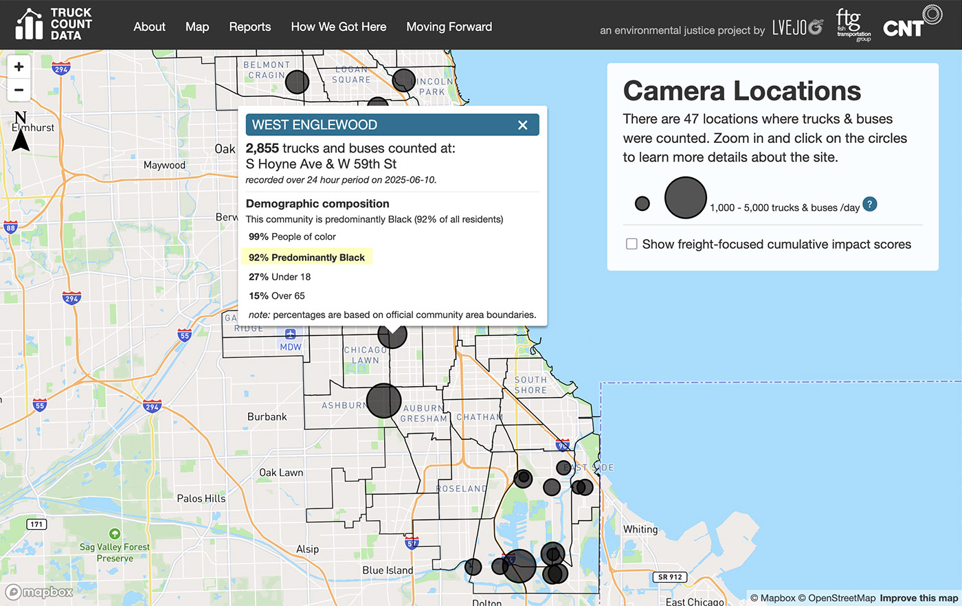
Where Is Truck Traffic Highest?
From the outset, a central goal was to make truck count data easy to explore geographically. Rather than displaying dozens of individual map pins, I designed a cluster-based visualization that communicates density at a glance. Larger circles represent higher truck volumes, allowing users to instantly identify hotspots across the city.
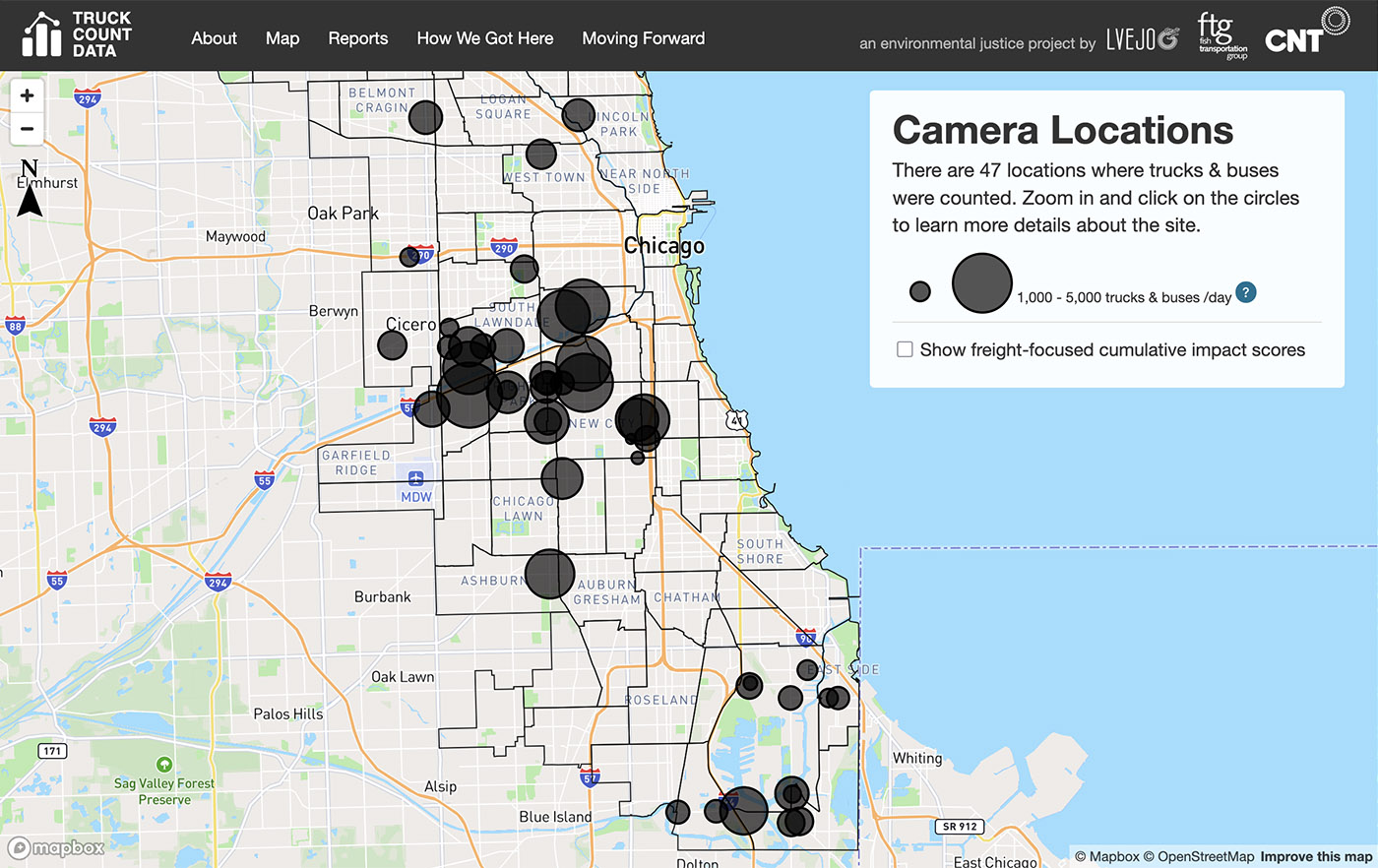
Clicking on any location reveals high-level context about that community, including total trucks counted and demographic information about the people living alongside all that toxic truck traffic.
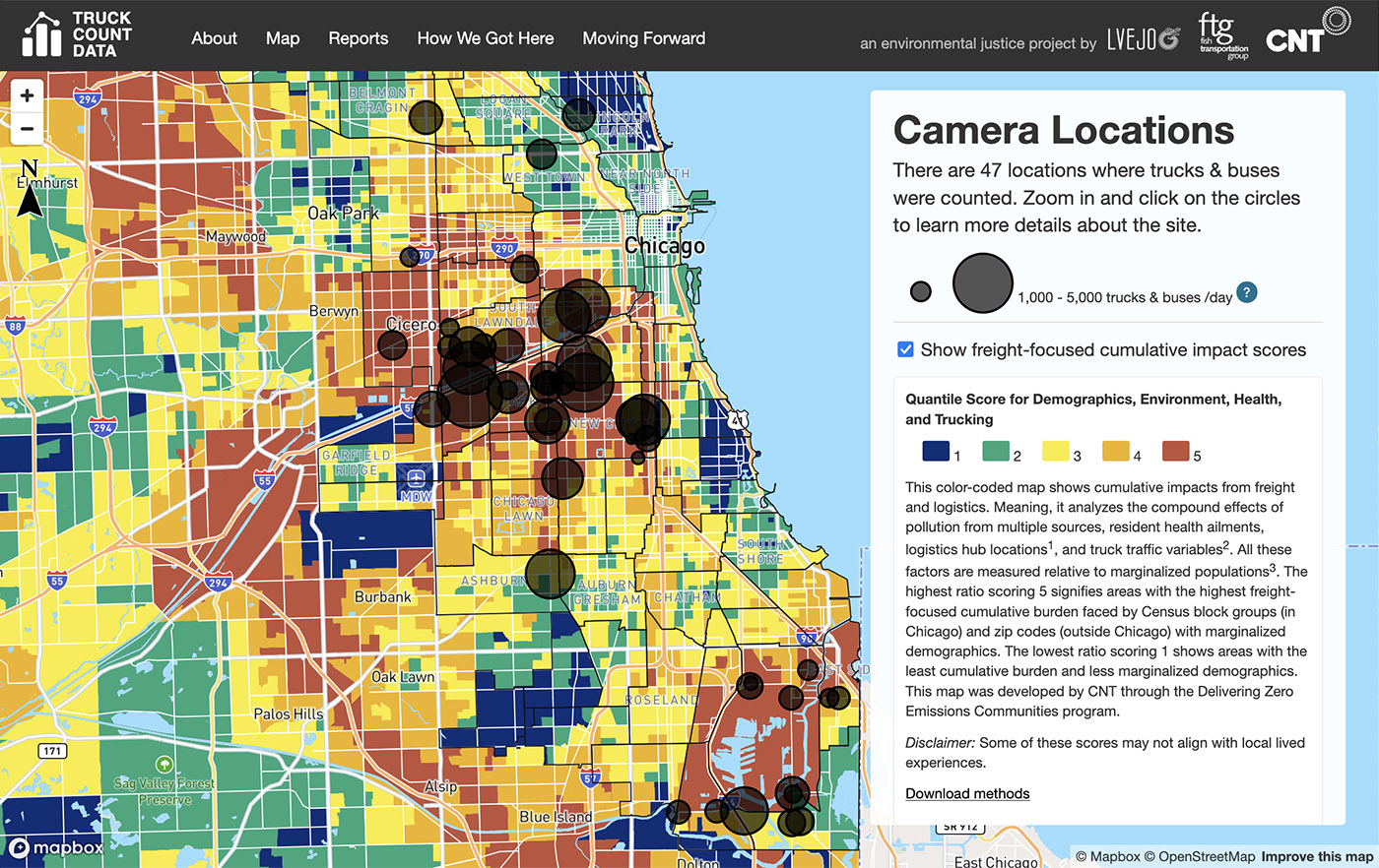
To provide deeper context, the map also includes a freight-focused cumulative impacts layer. This visualization combines data on pollution sources, resident health indicators, logistics hub locations, and traffic patterns to show how environmental burdens are distributed. The result is a clearer picture of which communities are most vulnerable to these combined impacts.
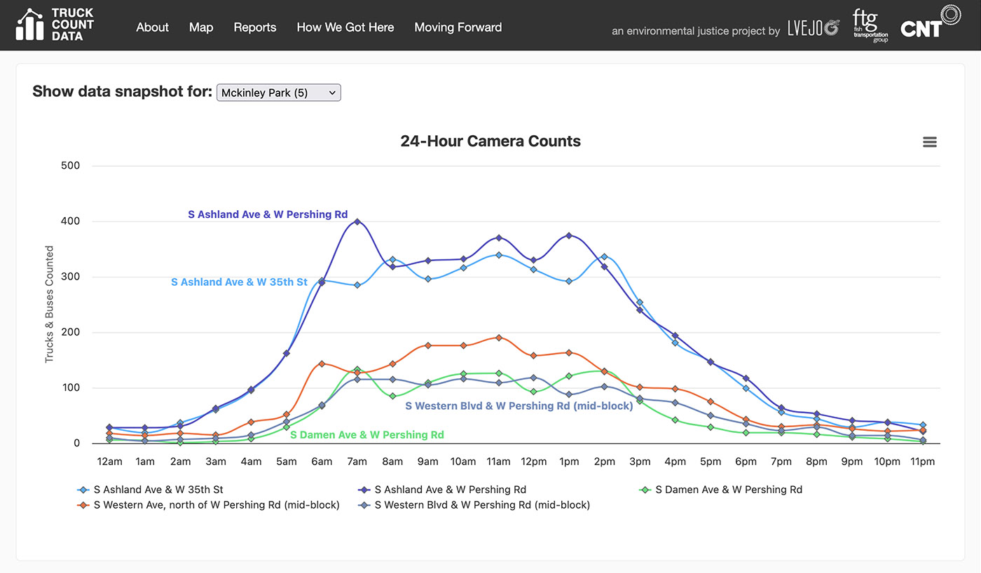
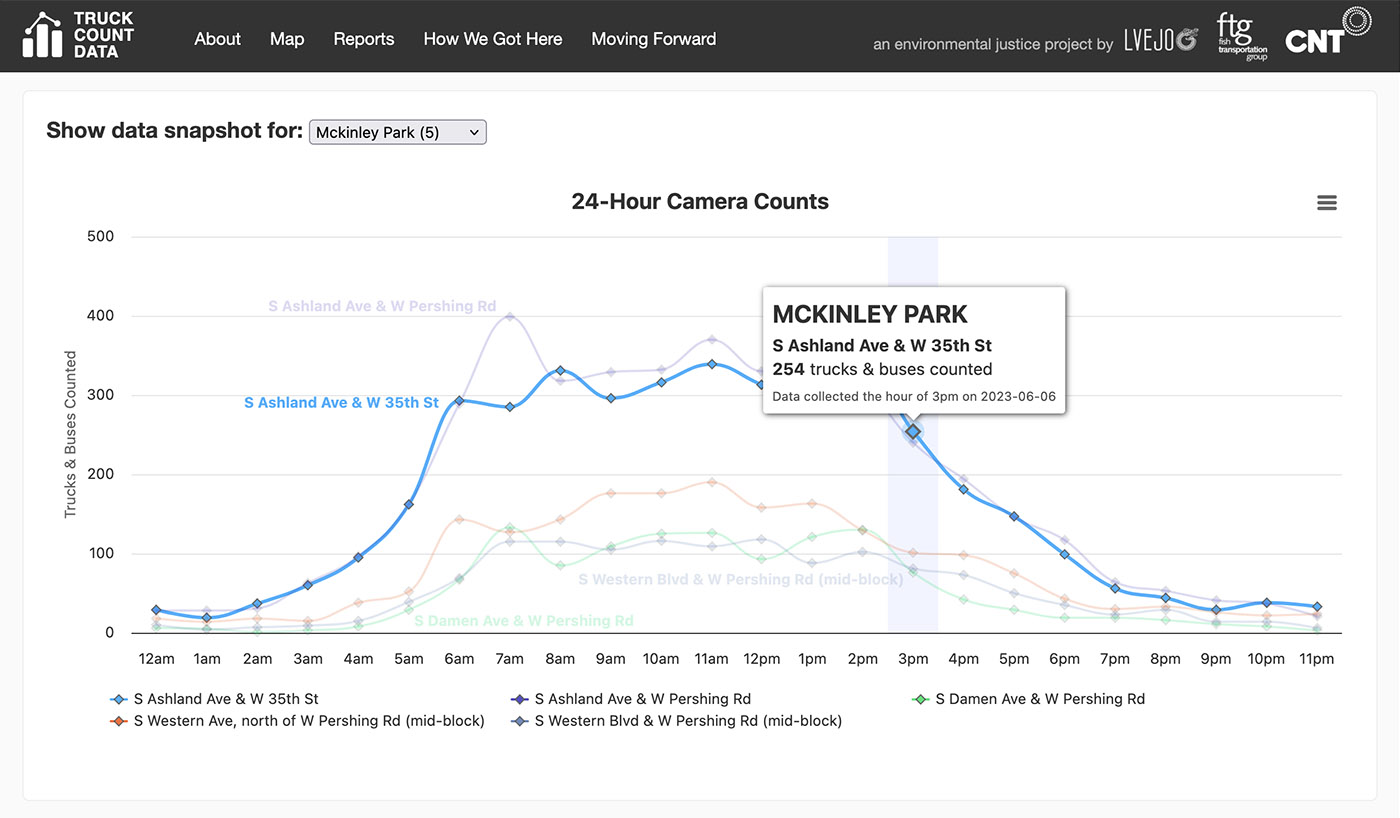
Data Downloads & Visualization
PDF reports and raw data downloads are comprehensive, but their level of detail can be overwhelming.
To make the high-level findings more approachable, I expressed datapoints through interactive charts that highlight key patterns and trends.
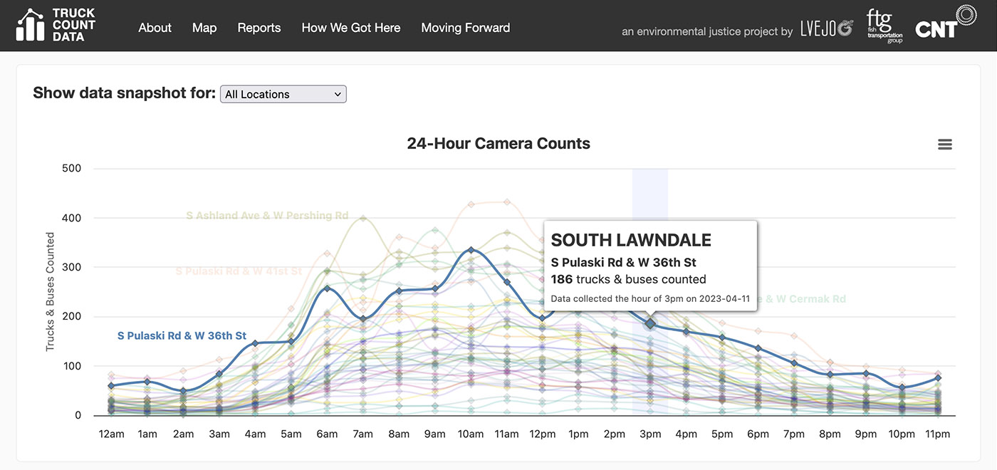
These visualizations break down truck activity hour by hour, helping users quickly understand when and where traffic is heaviest. By translating dense datasets into clear graphics, the portal turns complex analysis into insights that are easy to explore and understand.
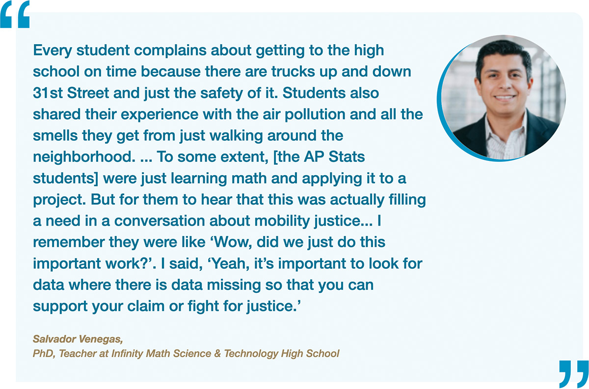
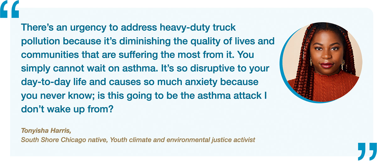
Community Voices
Data can quantify a problem, but it can’t replace lived experience. Throughout the project, we worked to amplify the voices of residents who live beside this truck traffic and diesel fumes every day.
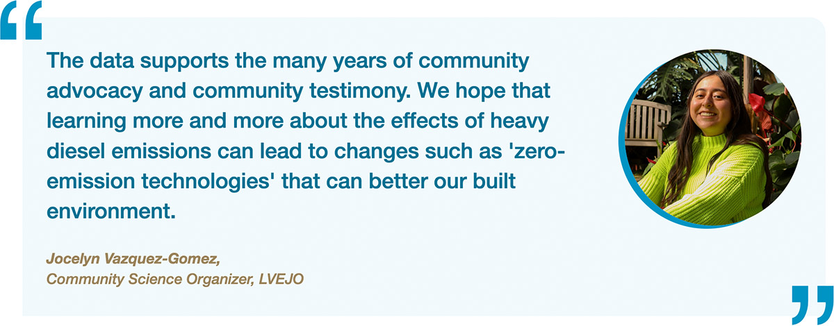
A key priority of the project was to center those perspectives—highlighting community stories alongside the data. Pairing personal narratives with measurable data ensures the issue is understood not just as statistics, but as a public health and environmental justice challenge affecting real people.
The Chicago Truck Data Portal transforms raw traffic data into a practical tool for communities and decision-makers. These are not modeled estimates—they are real counts, gathered directly from Chicago streets.
By making this information open and accessible, the project strengthens the case for cleaner air, safer streets, and more equitable transportation policies.
Visit the website: